With the release of Stratusphere UX 5.7, new Sparkline Graph dashboards have been introduced to the Advanced Inspectors. A Sparkline is a small line graph, which shows the variations in data over a defined period. It is meant to be succinct and pointed but provide meaningful information. That is exactly what the Stratusphere UX Sparkline graphs do. They look at key metrics across a number of different dashboards to provide relevant information of your environment that help guide you to identify possible issues and their associated root cause.
So let’s look at two common issues that may occur in your environment and review specific workflows using the Stratusphere UX Sparkline graph dashboards to help solve them.
Identifying Potential Environment Issues
- Start With a Top Level Sparkline Dashboard
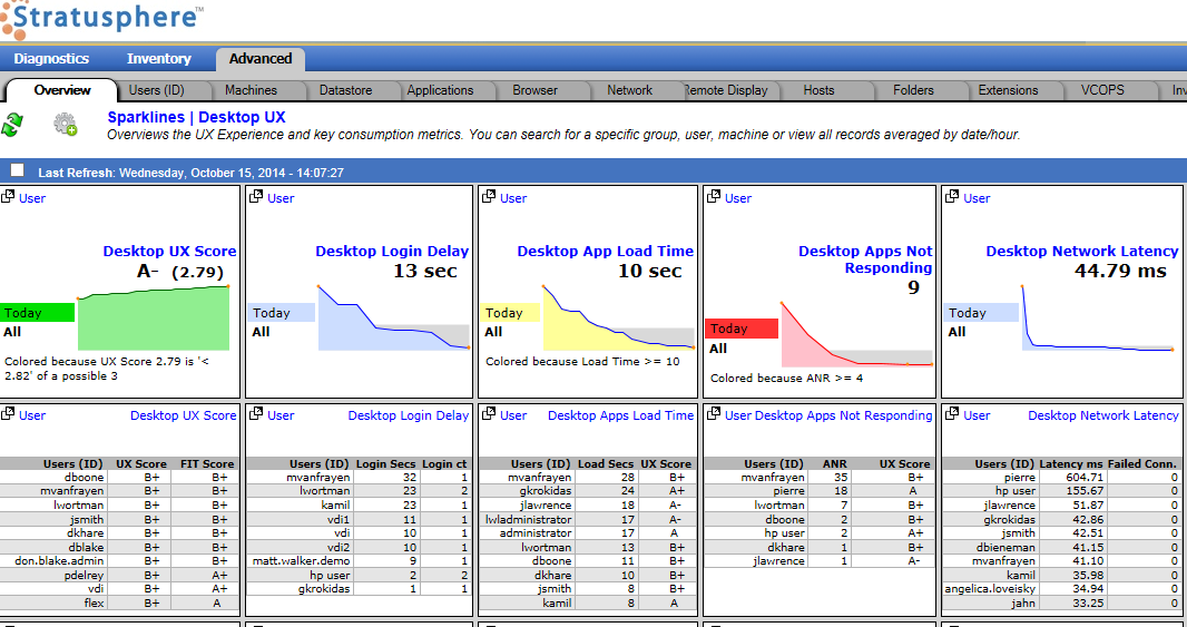
In this case we are starting with the Desktop UX dashboard. This provides a top level overview of the various metrics affecting your desktop user experience. Each Sparkline graph has an associated table beneath it indicating the top 10 users for that particular widget. With this pairing so you can see both the charted data (up to 168 items or a full week charted by hour) and look for anomalies as well as a top 10 list.
Another key feature of each Sparkline graph is the plotting of the average value, as indicated by the grey bar. This provides a baseline for how is your environment is running specific to the Stratusphere metric. You can hover over the graph reviewing those items above the average line and those below.
    2. Review various Sparkline graphs for any metric anomalies or possible issues
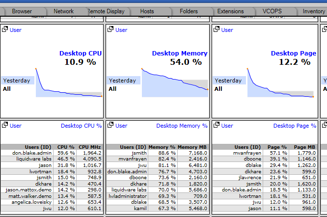
Let’s look at the Desktop Memory graph below. It indicates that 54% is the average memory used for yesterday, which is the time frame we choose to look at. You can see that a number of users are above that average line and the highest being the user ‘jsmith’. This user is showing 88.6% memory usage from the table below the Desktop Memory Sparkline.
- Focus on specific user on the graph with an issue for the metric
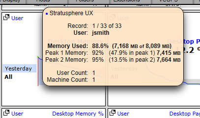
Now let’s hover over the graph and look closer at this user. You can see the user’s desktop has 8 GB available and was using about 7.1 GB of memory on average. Peaks over the time period were into the 90+ percentiles.
We can easily use the Advanced Inspector Sparkline graphs to drill into that user and determine what applications or processes are driving that memory usage.
- Click on the user to redraw the Sparklines just for that user, it is now trending
Next click directly on the Sparkline graph while hovering over the user you are interested in analyzing further. In this case the user ‘jsmith’. The Sparkline graphs will now redraw specifically for that user over the timeframe previously defined. In this example, it was yesterday.
The graphs now are shown in trending mode. This plots the metrics over time, so you can see how it behaves throughout a day or a week, depending on your date range. You can see how they trend hourly over those periods. For example, in the below graph it is very clear there was a CPU spiked for this user during the middle of the day, while Desktop Memory was very consistent at around 88% for the entire day.
This trended look at the data for a specific user gives a complete overview of the Stratusphere UX metrics affecting the user’s experience. Even though we started the workflow looking at desktop memory this new dashboard can now show potential other issues or concerns that would need to be investigated further.
- Switch to Desktop Apps (User) Sparkline Graph for Application Analysis
With the user’s trending graphs we were able to see an overview of the metrics and could review further any metric anomalies or concerns that were visible. When we started this workflow we identified desktop memory as a potential issue for this user so now let us look more closely at that metric as well as the processes and applications running.
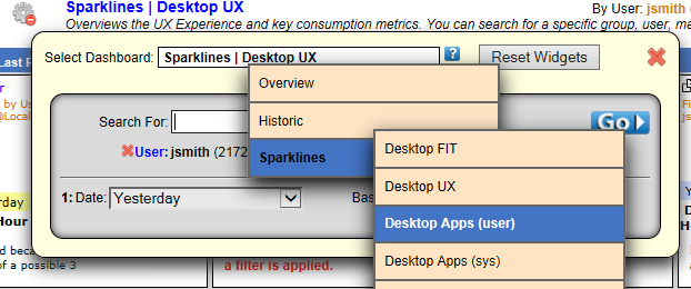
Click on the gear widget in the top left corner to change the Sparkline Dashboard to the Desktop Apps (user) Dashboard. Go to ‘Select Dashboard’ -> ‘Sparklines’ -> ‘Desktop Apps (user)’.
Note: This widget provides a number of powerful functions to work with the graphs, dashboards and Sparklines. In addition to changing the dashboard you can Search for Users, Machines, Groups, Change the Date Range, Change the Basis to Trending and Reset to the default Widgets.
The Desktop Apps Sparkline Graphs will show various application and process metrics and in this case filtered for the user we are reviewing, ‘jsmith’. This automatic filtering occurs because we had already drilled into the graphs for that user. You can remove the filter at any time and the Sparkline graphs will then be shown across all users.
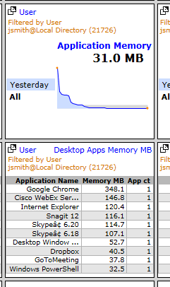
Let’s focus directly on the Application Memory widget, since that is where we started this workflow. You can hover directly over the graph to view the applications or user the table underneath it showing the top 10.
We can see very easily that ‘Google Chrome’ followed by the ‘Cisco Webex Service’ and ‘Internet Explorer’ is the key applications driving the user’s high desktop memory usage. Chrome specifically was consuming 348.1 MB over the time period.
Using the Stratusphere UX Sparkline graphs we were able to very quickly identify a possible issue and following a few workflow steps find a potential root cause. This is a powerful tool that can reduce time and effort when you are trying to understand what is occurring with your desktops and users and determine what the possible causes of any issues are.
Reviewing Applications
This leads us directly into the second workflow to discuss. That is “Reviewing Applications” across the environment for any possible trends or issues effecting the entire user community or a specific group, user or machine.
In the first workflow we identified ‘Google Chrome’ as a high desktop memory application for the user ‘jsmith’. Now let’s look to see how that application, as well as other applications is performing across all users or machines. We can determine if an application is a problem for many users or just directed to a certain specific one. We can also look at what times maybe an issue. For example maybe there are delays when every starts Outlook in the morning or when users launch a specific business application after returning from lunch.
- Start at Top Level Desktop Apps (User) Sparkline
We want to start at the Top Level ‘Desktop Apps (user)’ sparkline. Make sure to remove any user filters that may have been applied.
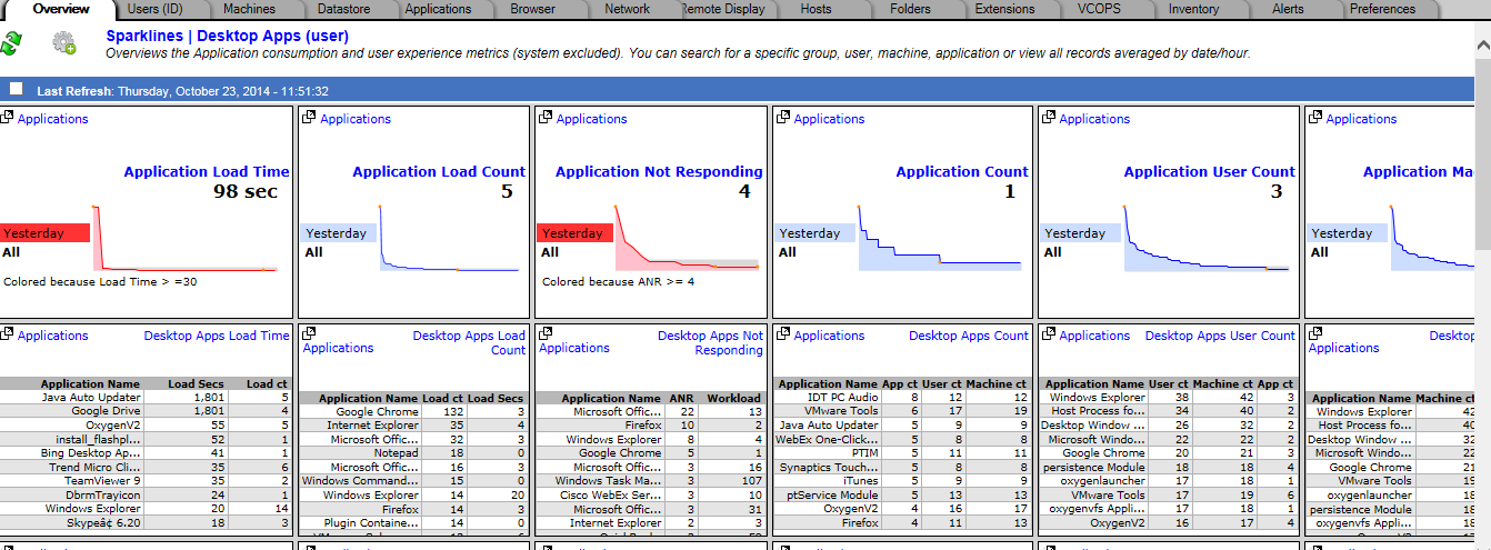
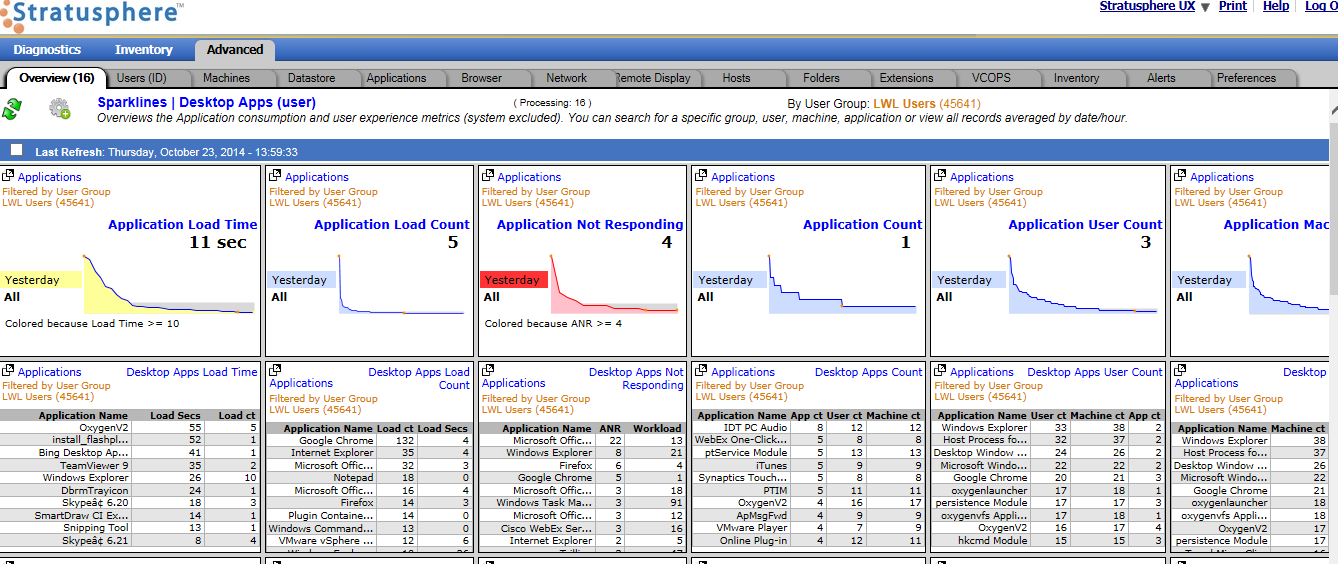
The graphs are now showing application specific metrics across all users for a period of time. In this case we are using ‘Yesterday’.
We can see the average bar plotted for each metric and those above or below that line. Immediately the Application Not Responding metric jumps out as having a few applications significantly over the average. The two showing the highest number are ‘Microsoft Office’ and ‘FireFox’.
- Click into Specific Application
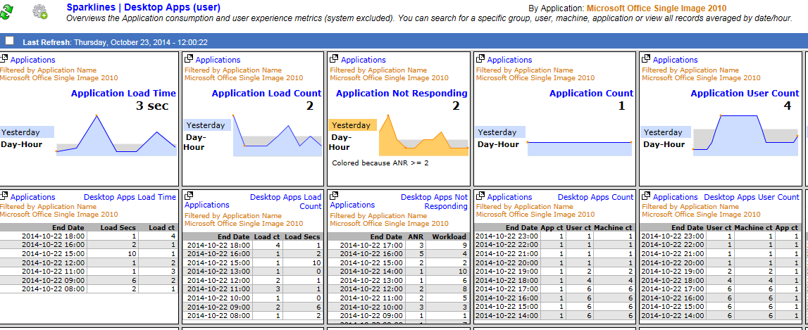
Let’s click into the widget specifically for Microsoft Office to investigate further. Simply hover over the graph to show Microsoft Office and click into the widget. The metrics are now shown trending over time. We can see Microsoft Office showed Application Not Responding throughout the day with the largest spike at 16:00 (4 PM).
Sometimes it can beneficial to change the data range and look over a larger time period, for example 30 days to review how the metrics for an application are trending. This can show if an issue is perpetual over time or maybe related to a specific day or time period.
- Review Applications By Group or By User
Using the same Top Level Sparkline dashboard, Desktop Apps (user) you can also review applications by Stratusphere UX Groups or by Users.
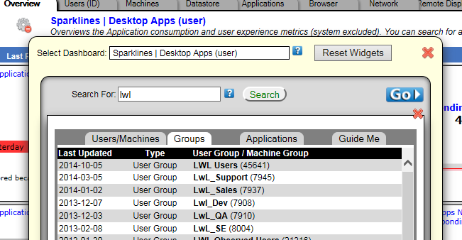
In this example we are interested in a specific group to review, ‘LWL_Users’. We do this by doing a search by lwl and then clicking the Groups tab for the appropriate match. Then click the Go button. If we were looking for users or machines that matched we would use the Users/Machines Tab.
The dashboard now focuses specifically on the selected Stratusphere UX user group. Since we are looking at a group it also switched to the metric widgets to view by application and that is exactly what we are looking for.
Looking at the Application Not Responding widget we can see ‘Microsoft Office’ has had the most issues for this user group, with ‘Internet Explorer’ also showing a high count. Now look at the Applications Count widget and lets look closer at the application ‘Web Ex‘. It shows it running for 8 users and 8 machines. But what is really interesting is under the ‘Apps Ct’ column it is showing there are 5 different versions of ‘Web Ex‘ . You can use the ‘Pop Out‘ function described next to investigate into what those versions are.
- Pop Out to Advanced Inspectors
If you need to do more detailed analysis of metrics show on a specific widget you easily ‘Pop Out’ to the Advanced Inspectors.
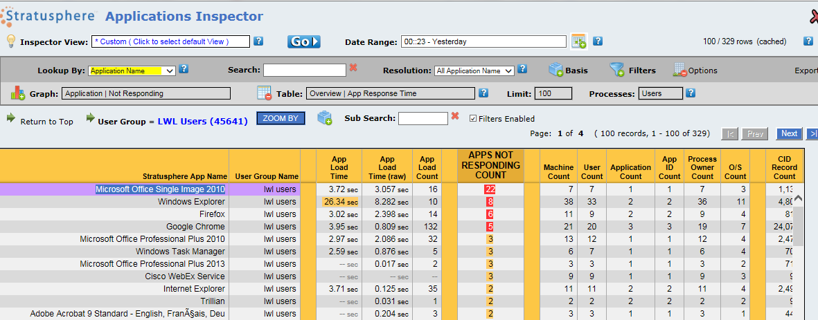
For this workflow you can launch the inspector for the Application Not Responding widget by clicking the ‘Pop Out’ icon in the left hand corner of the widget.
This can be done from any widget and it provides a quick and easy way to drive to the right advanced inspector with all the associated correct settings needed directly from the dashboard.
For this workflow a new browser was launched for the Advanced Applications Inspector in order to look further into the applications not responding. Here you can use all the functionality and the features of the Advanced Inspectors, like drilling into your data or adding a basis. The beauty of it being that you will able to configure the appropriate inspector simply by clicking into a Sparkline widget from the dashboard.
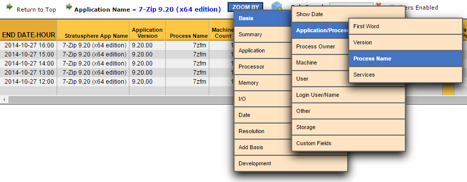
Note: You can use the Zoom By button on the Advanced Inspectors to expose additional Basis columns like Version, User, Machine, Groups, Process Name, etc.
Conclusion
We have seen how easily and effectively the new Stratusphere UX Sparklines can be used to review, understand and troubleshoot your environment and user experience. We have gone over two common workflows that may occur, but there are countless workflows that can be done quickly using these robust graphs. With any of them start at the Top Level dashboards and then drill into the graphs to review the detail and trending for users, desktops and applications.
More Information
For more information on Liquidware Labs Stratusphere UX visit the Stratusphere UX Product Page or contact sales at Liquidware Labs.
Pete Del Rey
Technology Evangelist
Liquidware Labs







Leave A Comment
You must be logged in to post a comment.