

In the Stratusphere UX 5.3 release we introduced new graphs to the Preview Inspectors. These are interactive graphs with a number of different functions and features that I wanted to look at in more detail.
To get started with the new graphs you need to enable viewing for them. When looking at the Preview Inspectors you can enable the the various graphs by clicking the Toggle Graphs icon in the top grey bar.![]()

Many Options
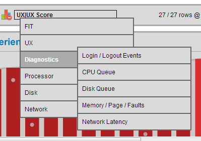
The first thing you will see is the many graphs available have been structured and grouped logically, so you can easily get to the available graphs specific to the area of concern. For example if you are looking for Diagnostic graphs about CPU or Disk Queues you would go to Diagnostics and then either CPU Queue or Disk Queue.
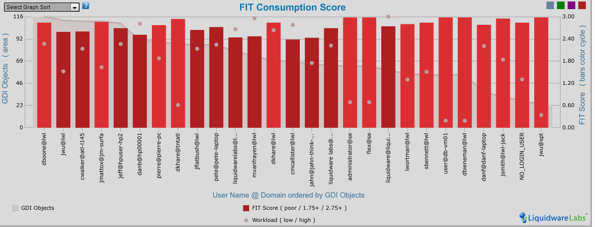
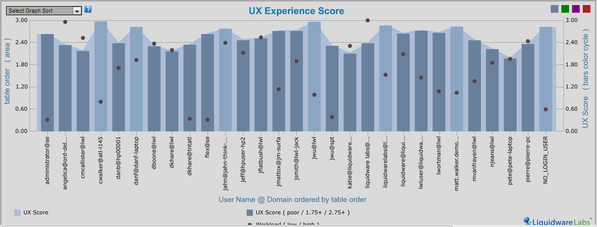
Once you are viewing your graph of choice, one of area to review is the legend at the bottom of the graph. It provides good information about the metrics plotted. Here is shows the sort ordering of how the data is ordered and show on the x-axis from left to right. In the below example the x-axis data is User Name@Domain and it is ordered by the UX Score.

Note: Graphs work independently of the Preview Inspector View chosen and you can pick any graph regardless of the View. The graph data is however based on the Inspector chosen as well as the data selection.
Interactive Data
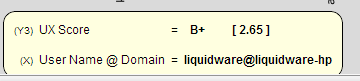
When working with graphs there can be a lot of information displayed and it is always important to make the data as easy as possible to understand and analyze.One way we do this with the preview graphs is to give an interactive approach to the graph data. If you move your mouse over the various data points on the graph you will see popup information show in the bottom left corner.
In this example we are looking at the Liquidware user and focusing on their UX score which is 2.65 which translates to a B+.
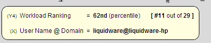
Next moving the mouse over the workload metric plotted on a graph, the interactive data shows the specific workload ranking, in this example the 62nd percentile.
Â
Zoom Into Detail
Another nice feature in the preview graphs, that is also interactive is the ability to click into some aspects of the graph to get detailed information about a specific component. This is called Zoom into Detail. The ability currently exists for the x-axis elements of the graph where you can get more detail on that element.
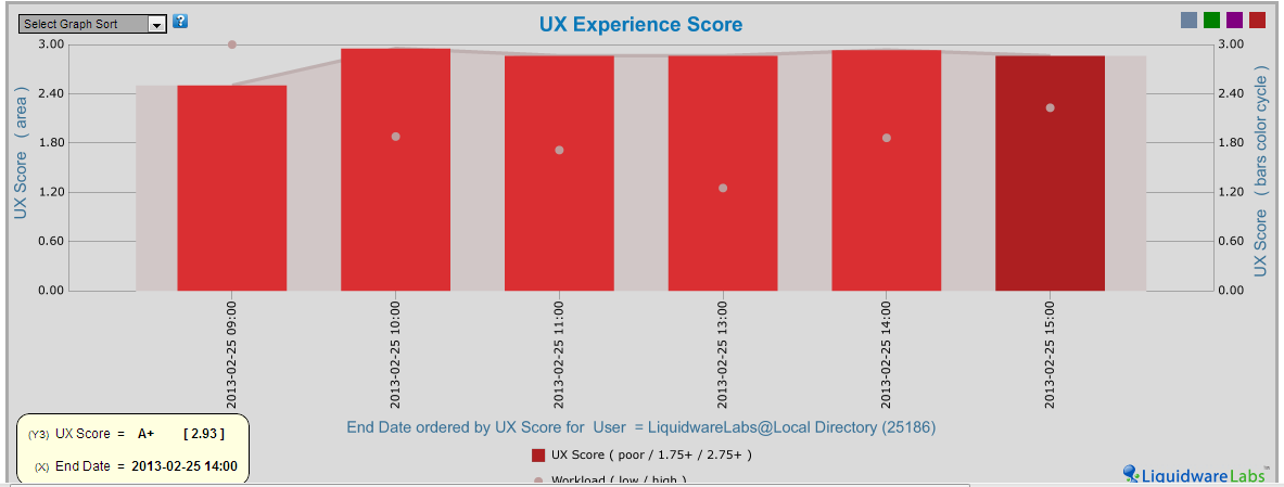
For example if you were looking at a graph and wanted specific information for one user plotted on the graph. you can zoom into it. In this example we use the LiquidwareLabs user and the UX Score graph.
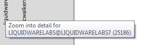
You would click on that user and the graph would redraw this time showing the UX scores for the LiquidwareLabs users plotted over time (End Date Ordered). The data result table will also reload with the new detailed data. This gives a nice and quick way to analyze more precisely your data in a graph format when you notice something of interest from a top level graph view.
Graph Sorting
The preview inspector graphs provide many different axis points for your data beyond a standard x and y. This gives a very robust view of the metrics and data shown. One way to enhance this view is done through graph sorting. In the top left section of each graph is a drop down box where you can change the sort order how the data is represented across the x-axis from left to right.
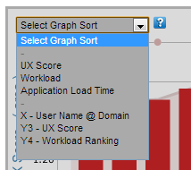
Selecting a metric from this drop down will modify the sort order of the graph and return the top-most 50 records that meet the query criteria.
There are three ways to sort the graph.
– Select from one of the Top 3 pre-defined sort orders.
– Select one of the ‘Y’ metrics below the 3 default sort options.
– Select a column header to be graphed as a user select-able metric. User select-able metrics bind to the left scale (S1)
Sorting with other columns
Another nice feature available is you can sort on any column that is available in your data result table even if it is not initially shown in the graph.
For example if you wanted to sort by GDI Objects from the resulting data rows just click on the heading in the table and it will add it to the graph.
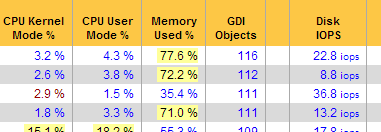
The graph is now ordered by GDI Objects as shown in the left axis as well as in the legend indicating (ordering by GDI objects). Notice that whatever metric you order by it will show in the area section of the graph.
Note: You can use this technique of ordering by any row in the data results table except if your initial graph is ordered by date.
Color Palettes
With any user interface there are always a lot of differences of opinions on what looks the best. With the new graphs we recognize there are different user preferences and have added a feature to allow the users to select their own graph color palette. Users can select between blue, green, purple and red palettes to show the graph data in the scheme that looks best for them and provides the best user experience.
![]()

The example is using the blue color palette for the UX Experience Score graph.
Â
Summary
The Stratusphere UX preview graphs offer a robust and easy to use interface in viewing and analyzing your data quickly and accurately. In addition it gives flexibility in how you want to view your data which can be an advantage to you when working with the many different metrics collected by Stratusphere.
Pete Del Rey
Technology Evangelist
Liquidware Labs