Updated Preview Inspector Graphs in Stratusphere UX 5.6
In the Liquidware Labs Stratusphere UX 5.6 release there are some key enhancements and additions made to the graphs for the Preview Inspectors.  The updated functionality and new graphs continue to make the Preview Inspectors graphs more robust with more options and flexibility. They provide you with the ability to quickly understand your data in a graphical format and drill into for more detailed information.
Preview Inspector Graphs
Some of the new enhancements to the graphs include more graph axis’s as well as detailed metric pop-ups for metrics on the graph. The UX Experience Score graph is a good example to look at in more detail, to highlight these enhancements.
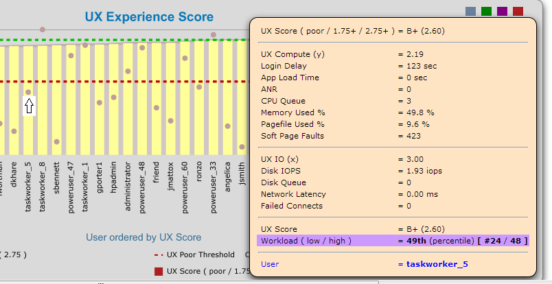
The graph by default shows the Stratusphere UX rating for each user. Now we have added some additional axis’s on the graph to really show where your users sit with their respective UX experience score. You will see a ‘UX Good Threshold’ axis in green and a ‘UX Poor Threshold’ in red. You can easily see which users are falling above the good threshold and which are below it.
Now let’s look closer at a specific user on the graph. We see the Workload Ranking plotted on this graph as well. The Workload Ranking is a composite metric looking at various CPU, Memory, Disk I/O and Network I/O metrics that the Stratusphere Connector ID (CID) collects.
Looking at the taskworker_5 user we see it has a workload in the middle of the graph and its UX score is just under the good axis. If we hover over the workload ranking we see the following graph tip window showing more detailed metrics for this user.
We can see the UX Score us a 2.60 which is B+ rating. Its workload ranking is in the middle as the graph, indicated at the 49th percentile. When a problem arises we can now see there is a login delay of 123 seconds. In addition we can see information on CPU queue, memory user, Disk IOPs and Disk Queue as well as other metrics. All of which is designed to quickly and easily understand what metrics are important and are driving the graph values being shown. In this example the metrics shown in the graph tip window are those important to determining the UX Experience Score.
Scatter Plots
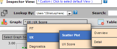
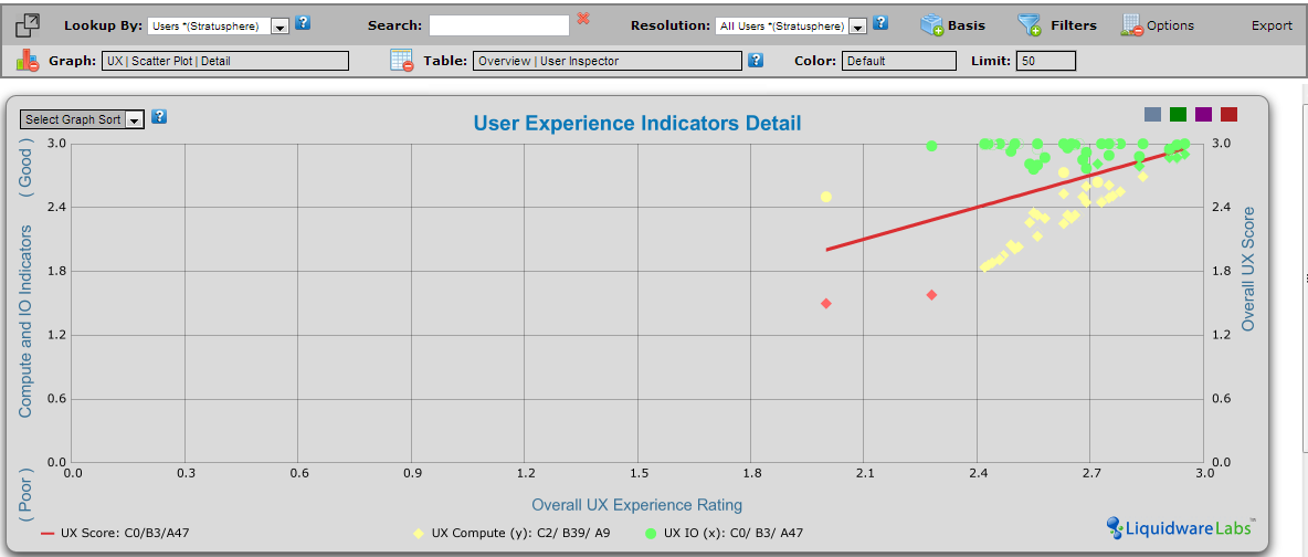
One of the new graphs added to the Preview Inspectors in Stratusphere 5.6 are Scatter Plot graphs. Scatter plot graphs show or plot a number of different metric indicators against the FIT or UX scores. For FIT it looks at consumption indicators while for UX it looks at user experience indicators. Scatter Plot graphs have both Overview and Detail versions.
Let’s look at one of the available Scatter Plot graphs in the Preview Inspectors in more detail. For this example we are going to use the UX Detail Scatter Plot graph.
In this graph it is showing the various users’ UX experience rating across the X axis with a number of compute and I/O indicators plotted across the Y axis. The red line is showing the trend of the UX ratings for each user ranging from about 2.0 up to almost 3.0. What is really nice about this graph is you quickly see what indicators are driving the experience rating straight from the graph. It is a compute indicator like memory or CPU queue or maybe an I/O indicator like IOPs or disk queue.
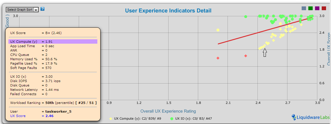
As we discussed previously if you move mouse over any of the metrics plotted on the graph you will get a graph tip showing the details of that component.
Here we are looking at taskworker_5 with an overall UX score of 2.46. Its UX compute calculation is a 1.91 driven by a combination of computing metrics that Stratusphere collects. You can see the details for CPU Queue, Memory User %, Pagefile Used % and others. In addition the key metrics that make up I/O indicators are also available.
With this detail along with the scatter plot graphs you can easily see a full picture of your user’s experience along with all the key indicators driving that experience either positive or negative.
For every graph available in the preview inspectors there is always the resulting detail data also available in a table view. Here you can view and work with any of the available metrics reported by the Connector ID (CID) agent. You can sort on any metric and drill into the table for more detailed records or click on a metric to show application data in a pop-up window. All of this providing significant power to an end user to analysis their data efficiently with a few clicks and selections.
More Information
The new and updated Preview Inspector Graphs in Stratusphere UX 5.6 continue to make your job easier and more efficient as you use the power of Stratusphere UX metrics with the Preview Inspectors to monitor, analysis and report on your machines, users and environment.
For more information on Liquidware Labs Stratusphere UX visit the Stratusphere UX Product Page or contact sales at Liquidware Labs.
Pete Del Rey
Technology Evangelist
Liquidware Labs







Leave A Comment
You must be logged in to post a comment.