Earlier this year Liquidware Labs released its Stratusphere UX adapter for VMware vCenter Operations (vCops). This adapter feeds the many different desktop and end-user metrics captured by Stratusphere UX into vCops for easy analysis and monitoring as well as root cause analysis.
We are now set to release 5 custom defined dashboards for vCenter Operations that built specifically to work with the Stratusphere UX adapter metrics. These dashboards can be used out of the box or can be further customized to fit your environment specific needs.
The 5 custom dashboards being made available are:
- FIT UX Overview
- Strat UX Heat Map
- Stratusphere Explorer
- Strat Comparison
- Strat UX :: Pool
 FIT / UX Overview
The FIT / UX Overview dashboard is maybe the most popular custom dashboard available. It uses a number of scoreboard widgets to show the many Stratusphere UX metrics being fed into vCenter Operations. Each widget;s color represents the health and score of the metric and group. By default it uses the ALL groups for machines and users that are fed from Stratusphere UX.
On the left side of the dashboard are Pool Summation metrics using the _ALL Machines resource-kind. On the right side are Pool Average metrics using the _ALL Machine resource-kind. These are summary metrics for all of your machines or user groups being sent from the UX adapter. Each scoreboard widget can be modified to use your own specific machine or user groups.
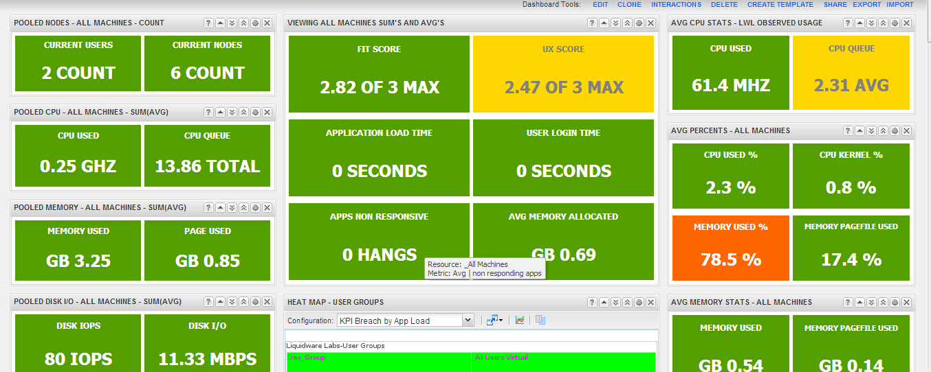
At the bottom of the dashboard you can select specific metrics for a specific Resource and those metrics will be charted in the ‘Stratusphere UX Metrics’ widget in the center column. This provides a nice way to compare important metrics and resources.
Note: To use this dashboard you need to enable ‘Intersection’ in Stratusphere UX under its vCops settings.
Strat UX Heat Map
A vCenter Operations Heat Map is a two dimensional widget where you can assign one metric to influence the size of the rectangle and the other to influence the color. In the Stratusphere Heat Map dashboard it has primary Heat Map by User Group whic gives a graphical way of seeing how various metrics are performing in each of your user groups. In addition it has a KPI alert widget that is updating over the last 6 hours showing metrics that have hit a KPI (Key Performance Indicator).
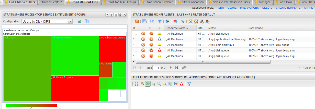
For the Heat Map in this dashboard it uses the number of users in the User Group as the metric to control the rectangle size and you can choose from the Configuration drop down box which metric to use for the color.
Stratusphere Explorer
The Stratusphere Explorer dashboard provides a simple way to view and chart over time any of the Stratusphere UX metrics fed into vCops for the various groups you have selected to export (Machine Groups, User Groups, and Users when Machine Groups and User Groups Intersect).
First select the Resource from the top left side that you want to work with. These would be the machine groups, users groups and intersects (machine group/user group) that you have set to export to vCenter Operations.
In this  example it is selecting the ‘All Users’ resource.
Strat Comparison
The Stratusphere Comparison dashboard provides a method to select metrics from different resource kinds (Stratusphere machine or user groups) and compare them in a graph format.
You can use the Stratusphere UX Selection 1 widgets to select and graph the first metric and then use the Stratusphere UX Selection 2 widgets for the second comparative metric.
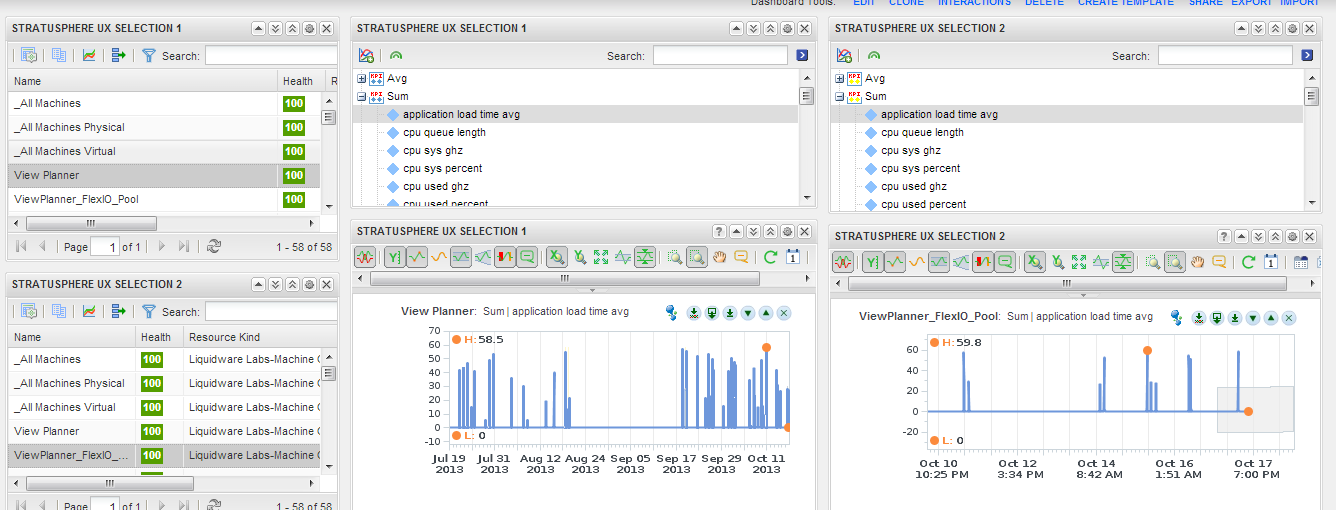
This provides a quick and easy way to compare and analysis metrics across different machine or user groups.
Strat UX:: Pool
The Stratusphere UX :: Pool dashboard uses a feature of the Stratusphere UX adapter called Intersection which groups the metrics by Users and their Machine Groups. The resource kinds created are in the format Logon User::Machine Groups. You can then select a intersect user from the Resources widget which would then fill in the ‘Last 7 Days Health Stratus’ widget and the ‘Mashup Chart’ widget.
A mashup chart shows different behaviors of the resource selected during a time period. For example you can see the Health of a resource over time.
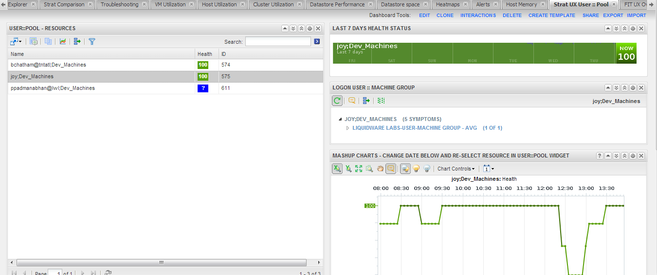
Note: To use this dashboard you need to enable ‘Intersection’ in Stratusphere UX under its vCops settings.
More Information
For more information on the Liquidware Labs Stratusphere UX adapter and Customer Dashboards for VMware vCenter Operations visit the Stratusphere UX Product Page or contact sales at Liquidware Labs.
Pete Del Rey
Technology Evangelist
Liquidware Labs
www.liquidwarelabs.com


Leave A Comment
You must be logged in to post a comment.