Stratusphere UX Workload Ranking
In the Stratusphere UX Preview Inspectors we introduced a new metric called Workload Ranking. This is an important new metric that can provide an easy look at which users and desktops are consuming the most resources in your environment. What is really nice about it is you can see this without having to review all of the different resource metrics individually. Workload ranking looks at them for you in one overall metric.
How does Workload Ranking Metric work?
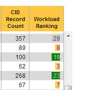
Workload Ranking is a composite metric looking at the various CPU, Memory, Disk I/O and Network I/O metrics that the Stratusphere Connector ID collects. Within each CID record, CPU, Disk, Memory and Network consumption are given a Rank Score. Then an overall Workload Ranking is given to the CID record. When viewing Workload Ranking in the table, a value of 1 is this highest workload. When viewing Workload Ranking in graphs, by default a higher number has the most workload unless you manually add the Workload Ranking from the table by selecting the column header. When viewing graph and sorting by Workload Ranking, make sure to use the graph sort control for this specific metric. The metric does give a higher weight to CPU and DISK I/O metrics over Memory and Network I/O.
Now for example if you look at users over 3 days the Workload Ranking can show you quickly which of your users are consuming the most resources. The metric is also colored coded and by default we sort the first 33% of the records as High, the next 33% as Medium, the following 24% as Low and the remaining 10 as ‘Detected’ or very low. Once high consumers are identified you can then start to drill deeper on those users to see the specifics and where the issues may occur.
Workload Ranking and Graphs
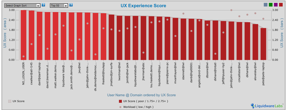
Since Workload Ranking is such an important metric you will see it show by default on a number of the Preview Inspector Graphs. In the below example we are looking at the User Experience Score graph showing users sorted by their UX rating. In addition their workload ranking is plotted to give a good visual look at how intense a user’s resource consumption against their experience rating.
In this example most of the lower experience ratings have high workload rankings but that is not always the case.
You can also add the Workload Ranking to any graph you are viewing by sorting on the column in data table. This adds the metric to the graph on the left side and sorts by that metric.
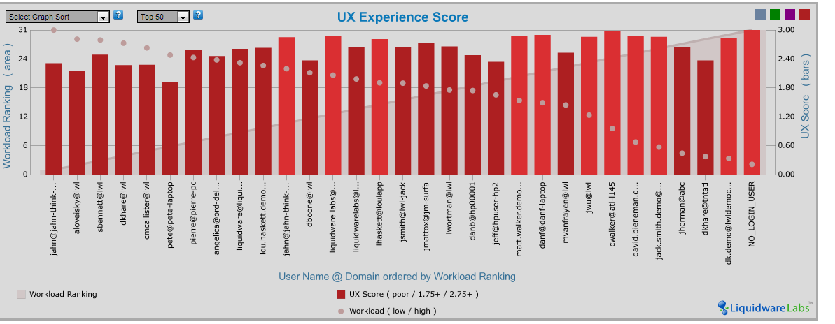
Note : When working with Graphs, the Workload Ranking in the sort dropdown is expressed using the ‘Rank Score’ metric and a higher value means more Workload.
Summary
Stratusphere UX is a powerful tool for Desktop monitoring, Validating and analyzing your desktops and user experiences. The new Workload Ranking metric enhances this solution providing an easier way to quickly identify resource consumption in your environment. As I say it a lot of my blogs, Check it Out and see how the Workload Ranking metric can help you understand your users and desktops better.
Pete Del Rey
Technology Evangelist
Liquidware Labs


Leave A Comment
You must be logged in to post a comment.